PREMISE
This project focused mainly on interface and branding design, without the process work that accompanies goal-directed interactive design. It was a chance for me to improve my user interface design and work brand identity into the design.
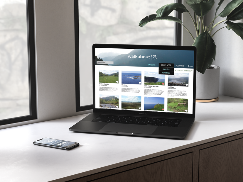
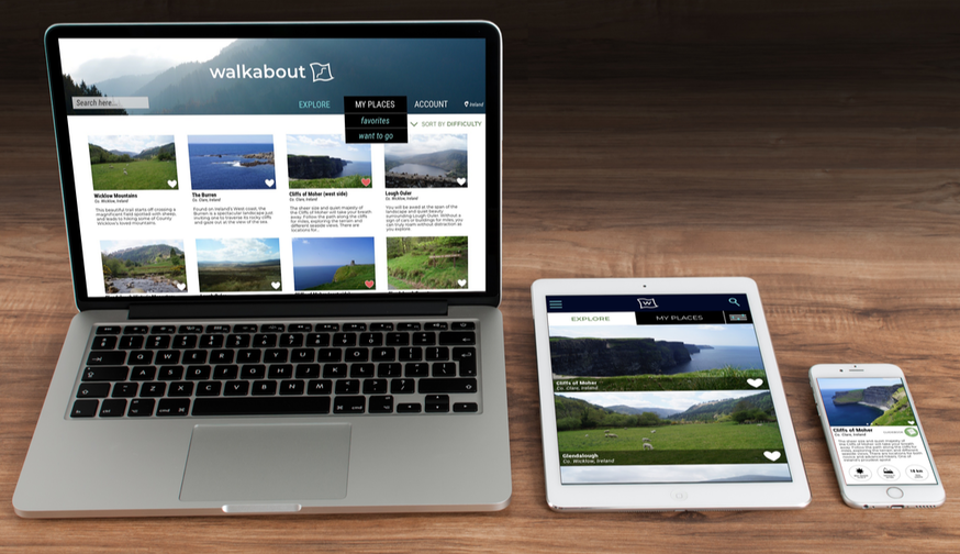
My assignment: to design the user interface for an app that allows hikers to find locations to go to in their area as well as a style guide. I was to design for web, mobile, and tablet screens.
My assignment: to design the user interface for an app that allows hikers to find locations to go to in their area as well as a style guide. I was to design for web, mobile, and tablet screens.
GOALS
- create a clean, image-heavy interface...
- that would assist users effectively...
- without forgetting the importance of nature to the brand.
PROCESS
INSPIRATION
To start getting some ideas for this project, I started looking at websites that offered similar services to my app to see what interface design and branding had been used.
To start getting some ideas for this project, I started looking at websites that offered similar services to my app to see what interface design and branding had been used.
I checked out the sites for REI and airBNB to get an idea for both the “hiking” and “finding convenient spots” aspects.
I also took inspiration from an e-commerce site I like, since I thought they have a good, clean layout for their navigation.
I also took inspiration from an e-commerce site I like, since I thought they have a good, clean layout for their navigation.
PLANNING STAGE 1 - WHAT DOES THIS PROJECT NEED?
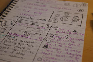
After getting some inspiration in my head, I started brainstorming for the basic functions and look of the app. I considered who my users were first, then went on to determine what they would need from the interface and what brand identity would serve the app best.
I was designing for a homepage in mobile/web/tablet interfaces, as well as a secondary and landing pages for mobile.
|
USERS
HOMEPAGE CONTENT
|
BRANDING
NAVIGATION BAR
|
I decided on my app name after this brainstorm session. Walkabout.
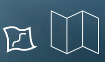
I came up with a logo idea, as well. A map. A simple design with a small path and "x".
I came up with a logo idea, as well. A map. A simple design with a small path and "x".
I wanted to keep the brand identity and visual design clean and uncomplicated. Using photos and colors that invoked nature could help the user keep their focus on seeking out hike locations, while the rest of the interface was going to present the needed information in a concise, effective way.
I also determined some details about the content for my screens.
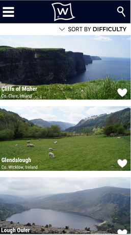
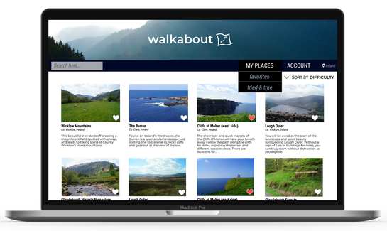
- my homepages would feature a layout of locations closest to the user, with brief information displayed about each place.
- The hiker could click or tap a location for more information about it.
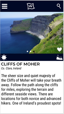
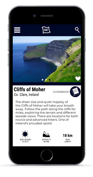
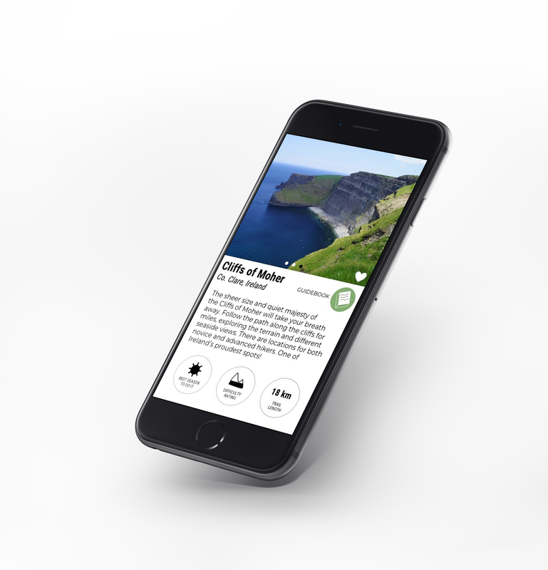
- For the secondary mobile page, the user would see details, difficulty level, etc about a specific hiking location.
FIRST DRAFT
With my basic details decided, I jumped into Sketch to design my first prototype. From my inspiration research, I drew on airBNB's simple grid layout and REI's strong use of nature imagery.
With my basic details decided, I jumped into Sketch to design my first prototype. From my inspiration research, I drew on airBNB's simple grid layout and REI's strong use of nature imagery.
Because of the pace of the Visual Design class, our first drafts were all high-fidelity prototypes, focusing on enhancing our interface design skills as opposed to full design process work. I found honing my interface design was helpful overall, but struggled a bit with this project due to the quick, minimal process work the time allowed for.
I decided to feature Ireland as the hiker's location in my prototypes because it's a place I hold near and dear to my heart. I used my own photos for the displays and planned to fill in the descriptor text with my knowledge from my travels. I love moments like these; they make design projects more personal and enjoyable.
FEEDBACK & CRITIQUE
I showed my process work and first prototypes to my classmates and professor and received critique from them. I explained that I was struggling with the look of the logo and the navigation bar on the desktop homepage.
I showed my process work and first prototypes to my classmates and professor and received critique from them. I explained that I was struggling with the look of the logo and the navigation bar on the desktop homepage.
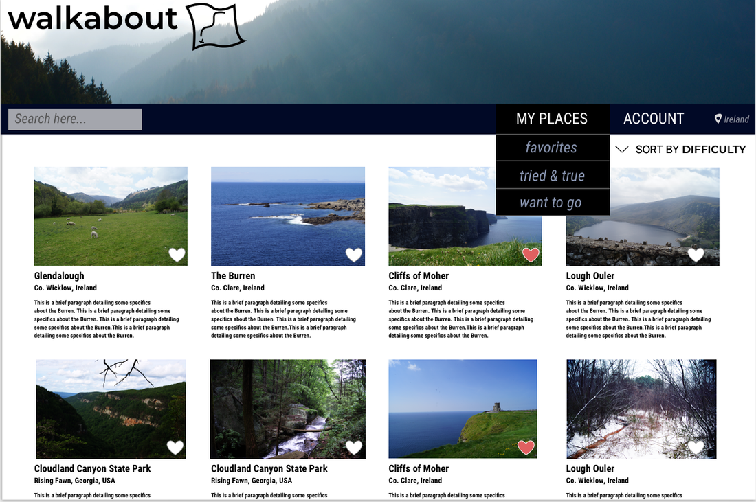
- For the navigation, I knew I wanted different categories for users to save places under, but didn't know how to differentiate them. "Favorites", "tried & true", and "want to go" weren't cutting it. I wasn't sure how best to offer the user different options, and my classmates' review confirmed that the current options were confusing.
- One of my classmates suggested making my map logo more boxy and geometrical as opposed to the more organic one I'd designed. I took this into consideration and tried it both ways in my designs.
ITERATION
PLANNING STAGE 2 - WORKING FROM CRITIQUE
After the first critique session, I took my class' revision suggestions and started work on them. I also started to design for my secondary mobile screen and tablet interface.
After the first critique session, I took my class' revision suggestions and started work on them. I also started to design for my secondary mobile screen and tablet interface.
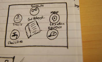
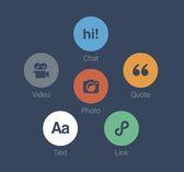
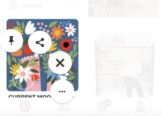
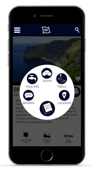
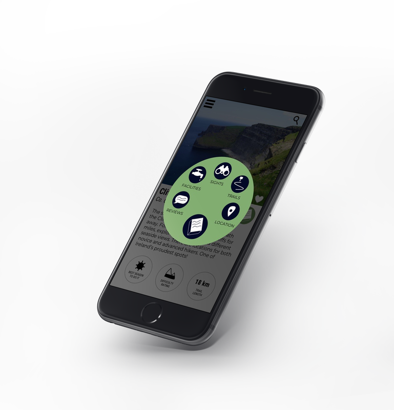
- For my 2nd mobile screen, I had the idea for a few photos, text, and a circular menu item I named the Guidebook. I was inspired by the circular menus of the Tumblr and Pinterest apps, and wanted to offer users information like sights, map location, facilities, and reviews for each location page without cluttering up the limited space the phone screen offers.
- I also decided to go with my original organic map logo, but tested it with and without the "x".
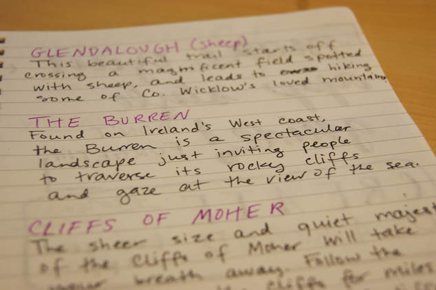
- I also started to write the paragraphs for my desktop homepage. For my first prototype, the interface had simple filler text. I enjoyed being able to describe the locations in Ireland from my own memories and experiences.
|
SECOND DRAFT
I worked on my revisions and presented the work I changed and added to my class for review.
I was happy with the progress I had made by this checkpoint.
I worked on my revisions and presented the work I changed and added to my class for review.
I was happy with the progress I had made by this checkpoint.
- I cleaned up the desktop navigation bar a bit by removing one of the tabs under "My Places" and simplifying the options for users.
- I also decided to remove the "x" from the logo, and was happy with the resulting clean look of it.
- On the 2nd mobile screen, I moved the icons down beneath the text and added small text underneath to clarify them.
- I also added the small Guidebook button to offer the user additional information about the location.
- I was very happy with how the menu wheel under the Guidebook turned out. I drew the Guidebook icons, as well as the secondary page icons, in Sketch.
I received a lot of good feedback from my classmates on the issues I was struggling with.
- A classmate recommended that I fill up the mountain in the "difficulty rating" with a straight line instead of a wavy one to better convey to the user what it meant.
- My class also recommended that I remove the actual colored bar from the navigation section in the desktop interface.
- They suggested that I simplify the options under "My Places" further still, which I think was well-informed.
PLANNING STAGE 3 - ALMOST DONE
- On the path to my final product, I wanted to clean up my sketches on the Guidebook menu wheel and add some color to it, so it was more engaging for the user.
- I felt like I could improve the top of the screen for the mobile homepage, as well. I wanted to go further than just making a "mobile version" of the desktop version.
- I wanted to add more color to the interfaces overall.
- I needed to determine what the users would need the most from the "My Places" tab, and find a way to incorporate that tab into the mobile interface as well. I was struggling with my own inability to decide how to categorize places on applications I use, like Google Maps, and had trouble figuring out how other people would most want to do it. Would they want places they "favorited", wanted to visit, or had visited before? Did these all overlap too much? What was the most concise way to offer users the option to save places?
FINAL PRODUCT
WHAT DID I ADD?
- On the path to my final product, I wanted to clean up my sketches on the Guidebook menu wheel and add some color to it, so it was more engaging for the user.
- I felt like I could improve the top of the screen for the mobile homepage, as well. I wanted to go further than just making a "mobile version" of the desktop version.
- I needed to determine what the users would need the most from the "My Places" tab, and find a way to incorporate that tab into the mobile interface as well. I was struggling with my own inability to decide how to categorize places on applications I use, like Google Maps, and had trouble figuring out how other people would most want to do it. Would they want places they "favorited", wanted to visit, or had visited before? Did these all overlap too much? What was the most concise way to offer users the option to save places?
FINAL THOUGHTS
- I'm really pleased with the visual design and brand identity I was able to do for this project. I think it's the best interface design I've done, and was pleased with the trial and error that allowed me to learn what worked best on my screens. I especially enjoyed learning how to work with the limited space mobile offers and how to use the space in the most efficient way.
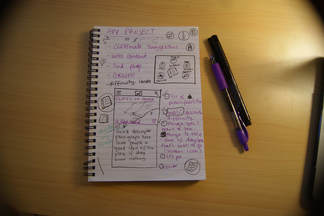
- Even with the quicker pace of this class, I feel that I did not plan efficiently at first. My biggest fault in design is jumping straight into the visual aspect of projects without taking enough time to sit down and plan everything out. I wish I had started by drawing my interfaces instead of going to Sketch first, so that I could have determined what screens worked and what didn't before putting the effort in Sketch.
- I feel that I accomplished my goals for this project: a clean interface that wasn't too busy that kept the brand.

