PREMISE
For my Senior Project class, I worked with my friend Christian’s small business Old North to give them a visual brand identity and design a prototype for a website for them to display and sell their products. Old North collects, fixes up, and sells vintage industrial furniture pieces, offering pieces that embody integrity and character. When designing the site and the visual brand identity for this company, I will keep in mind the company’s function, meaning, and values.
The goal of Senior Project was to carry out a Goal-Directed Design project. Goal-Directed Design is a process of Interaction Design - a process that follows a series of steps including persona creation, scenario writing, and prototyping to create a product specifically designed for the people who will be using it.
GOALS & TIMELINE
This class worked in phases of 3 checkpoints. My fellow classmates and I created semester plans to detail which stages of Goal-Directed Design we would have completed by each checkpoint. Below is the plan I created for myself:
TOOLS USED
For this project, I used InVision Studio and Figma. I liked InVision for my early prototyping, and Figma for my later more hi-fidelity prototyping.
The goal of Senior Project was to carry out a Goal-Directed Design project. Goal-Directed Design is a process of Interaction Design - a process that follows a series of steps including persona creation, scenario writing, and prototyping to create a product specifically designed for the people who will be using it.
GOALS & TIMELINE
This class worked in phases of 3 checkpoints. My fellow classmates and I created semester plans to detail which stages of Goal-Directed Design we would have completed by each checkpoint. Below is the plan I created for myself:
- Project Checkpoint 1: Research & Modeling
- Project Checkpoint 2: Requirements & Framework
- Project Checkpoint 3: Refinement & Support
TOOLS USED
For this project, I used InVision Studio and Figma. I liked InVision for my early prototyping, and Figma for my later more hi-fidelity prototyping.
RESEARCH & MODELING
|
RESEARCH SESSION
I sat down with Christian and asked him some questions about the company, the furniture pieces, and who he potentially thought his users were.
I sat down with Christian and asked him some questions about the company, the furniture pieces, and who he potentially thought his users were.
- What do I need to know about the company and Vintage Industrial Style?
- The company scours barns/basements/garages in PA for vintage/antique/industrial pieces that are essentially decrepit. They're brought back to GA and restored, character is made intact, new life is breathed into them before they’re sold.
- Textural. Industrial. Durable. Strong. Unique. Special.
- Each piece is individual and has a story. Back in the 1920s, one of these tables would have been sat at for hours at a time. It was a part of someone's life.
- These pieces can bring character to a minimalistic space.
- Who are the competitors?
- Overall, other vintage industrial retailers.
- Specifically:
https://www.retro.net/ (Sells custom vintage industrial STYLE pieces)
https://www.kudzuantiques.com/ (A large antique market that doesn’t sell online)
- What makes the company stand out?
- You wouldn’t find these pieces other places, because many others focus more on Mid-century Modern.
- The pieces can be purchased online.
- Other sellers’ pieces are overly clean and manufactured – Old North’s have old paint, steel showing through, dark wood, rough edges. The pieces’ imperfection gives them CHARACTER.
- What is the look the brand will need?
- lots of white and muted colors, to emulate the setting of the physical piece
- brown, grey, dark green, white (white space!), cream
- factory icon incorporated with logo
After asking Christian these questions, we delved into who we wanted our target users to be and who we thought they might be.
|
PERSONAS
Personas are an important part of Goal-Directed Design. They "represent the goals, motivations, and behaviors of a target user base". Personas help designers think and design for actual people. With users' goals and motivations in personas, you can be targeting the users your product is designed for and have them in mind.
Personas are an important part of Goal-Directed Design. They "represent the goals, motivations, and behaviors of a target user base". Personas help designers think and design for actual people. With users' goals and motivations in personas, you can be targeting the users your product is designed for and have them in mind.
|
RUTHIE WADE -
PRIMARY PERSONA Ruthie Wade, 27, married
|

|
WHAT IS HER GOAL?
Ruthie wants a trustworthy, simple, convenient way to be able to purchase the antique furniture she desires.
Ruthie wants a trustworthy, simple, convenient way to be able to purchase the antique furniture she desires.
After creating Ruthie's persona and identifying her goal, I moved on to my secondary persona, Arthur.
|
ARTHUR CANNON -
SECONDARY PERSONA Arthur Cannon, 34, single
|

|
WHAT IS HIS GOAL?
Arthur wants to find nice, high-end looking, slightly artistic furniture to fill his Buckhead apartment.
Arthur wants to find nice, high-end looking, slightly artistic furniture to fill his Buckhead apartment.
PROJECT PLAN
After creating my personas and determining their goals, I finished my final requirement for this stage: laying out my plan for this project.
After creating my personas and determining their goals, I finished my final requirement for this stage: laying out my plan for this project.
|
To design a web interface that allows users to purchase vintage industrial pieces in a convenient, effectively laid-out way. The information hierarchy and navigation will clearly direct the user on how to carry out their goals. The interface will cleanly represent the brand and the style of vintage industrial while not distracting the user from their tasks or goals. |
REQUIREMENTS & FRAMEWORK
|
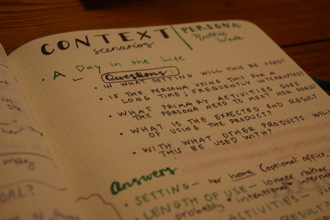
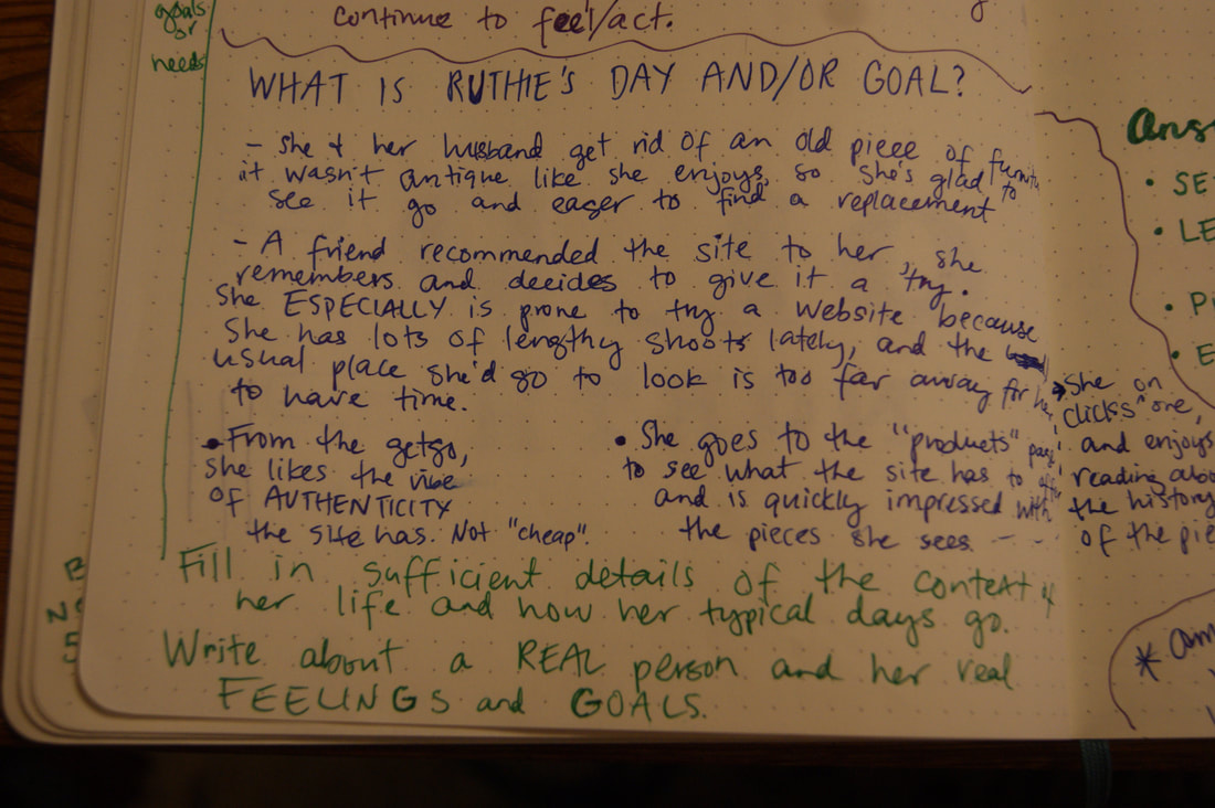
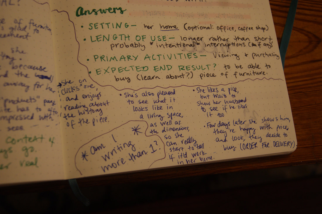
Scenarios help designers tune into the user's perspective even more and understand what steps and paths users might take when using the product designed. My scenario allowed me to have more realistic user goals in mind when I started to design the user experience of the website - it helped to move my designer bias to the background and really have understanding of and empathy for my users.
|
|
|
|
|
UX SKETCHING & WIREFRAMES
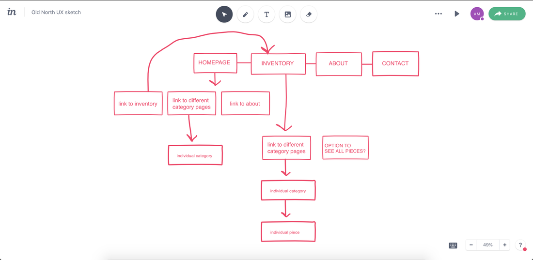
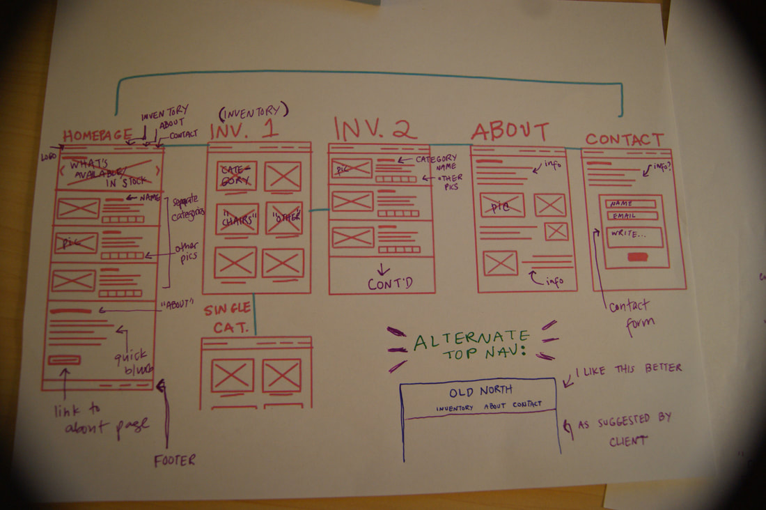
Using my context scenario, I drew out what my persona would need from the website. Looking at the scenario, I made a list of what I noticed my persona using on the site. I then started sketching out the site's user experience, using InVision's Freehand feature.
Using my context scenario, I drew out what my persona would need from the website. Looking at the scenario, I made a list of what I noticed my persona using on the site. I then started sketching out the site's user experience, using InVision's Freehand feature.

|
|
From the UX sketch, I started creating lo-fi wireframes for the different pages of the website. I started out drawing them in my sketchbook, but wanting to try InVision's Freehand application again, I pulled out my tablet and used Freehand to quickly make the rest of the wireframes. I decided I really liked it for rapid, iterative wireframing.
|
|
Through my wireframes, I decided that simple was the way I wanted to go with this project. I felt it matched Old North's aesthetic and brand.
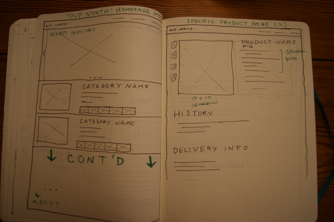
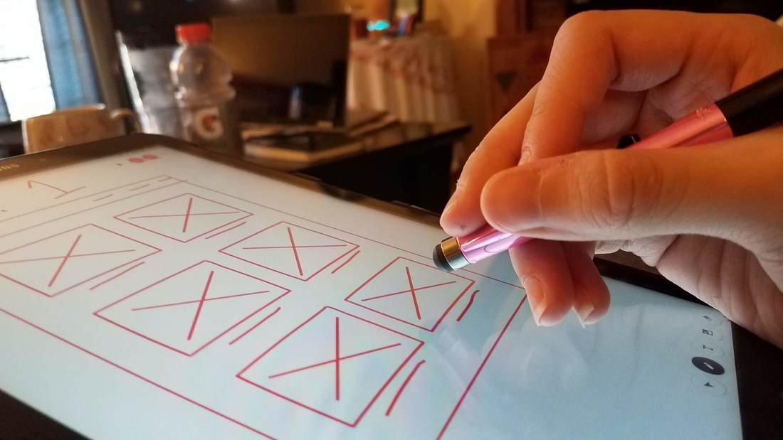
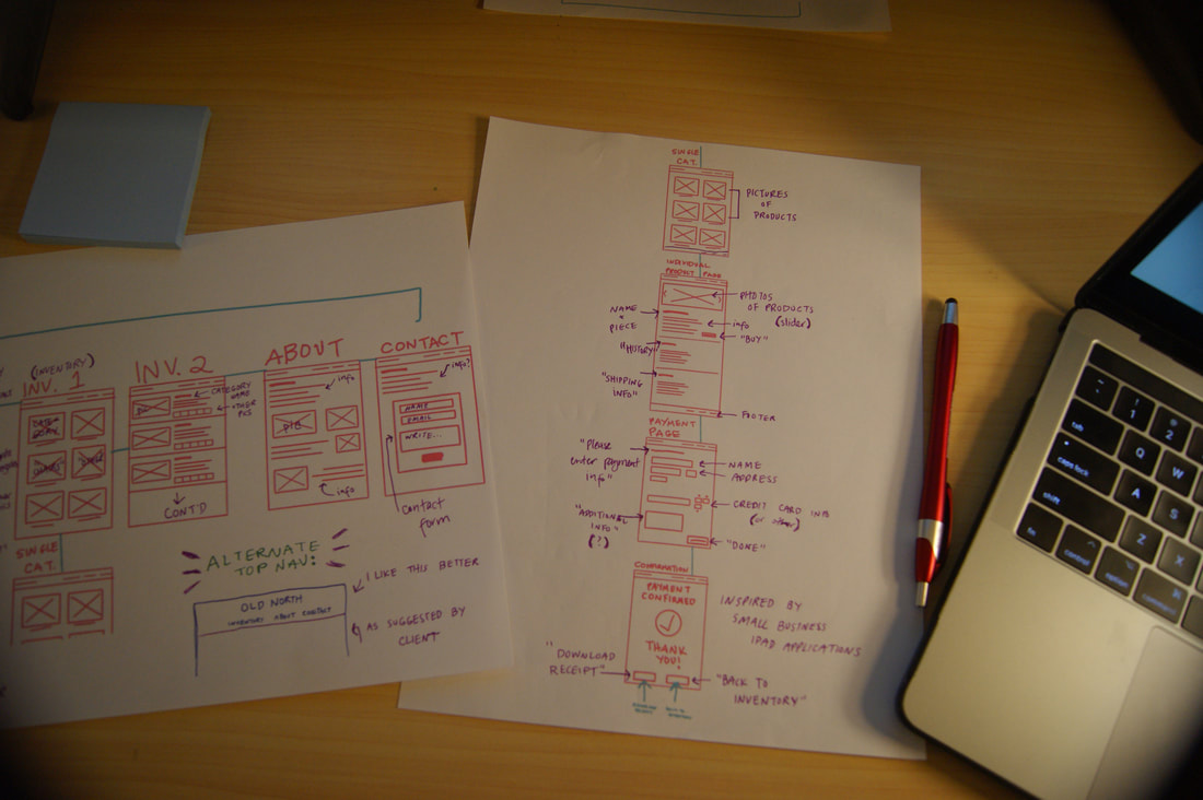
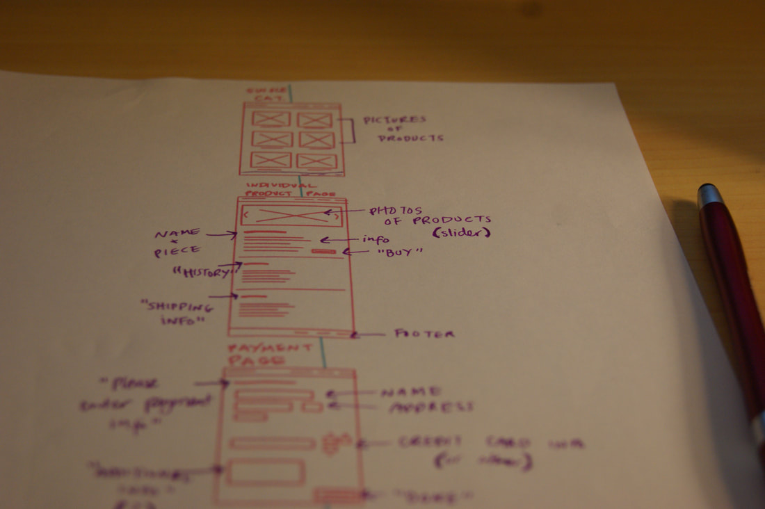
I enjoy working on and off screens, so I printed off my Freehand wireframes and, pen in hand, started filling in what I thought would work best on each screen. I thought this would help with the prototyping phase.
I enjoy working on and off screens, so I printed off my Freehand wireframes and, pen in hand, started filling in what I thought would work best on each screen. I thought this would help with the prototyping phase.
|
|
|
LO-FI PROTOTYPING
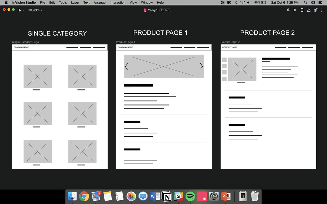
After my sketches, I moved into InVision Studio to begin lo-fidelity prototyping. Having done my wireframe sketches beforehand made starting this process a lot easier.
I originally intended for my pages to scroll down a lot, so made them quite long in my lo-fi prototypes.
After my sketches, I moved into InVision Studio to begin lo-fidelity prototyping. Having done my wireframe sketches beforehand made starting this process a lot easier.
I originally intended for my pages to scroll down a lot, so made them quite long in my lo-fi prototypes.

|
|
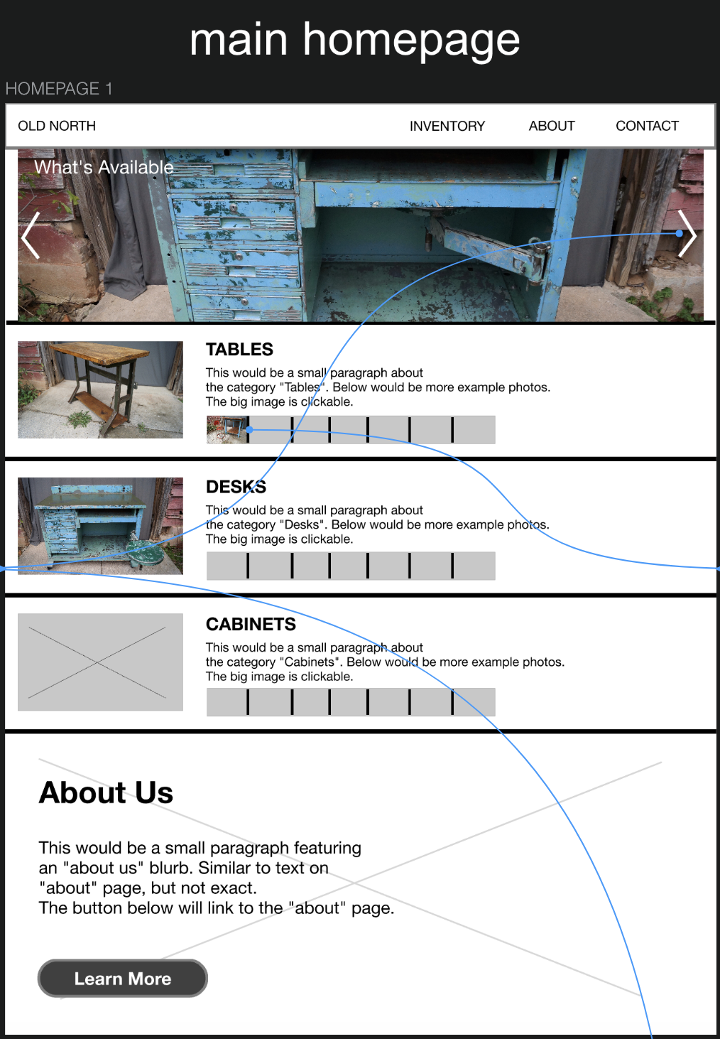
I then started adding images to make the prototype a bit more realistic looking.
|
|
|
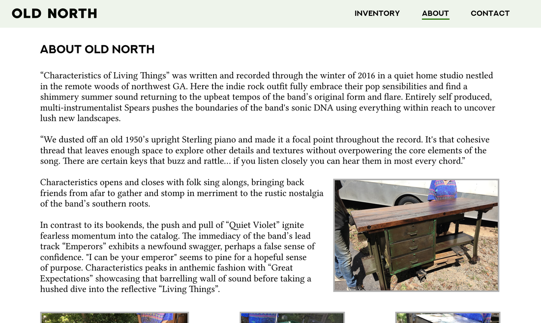
VALIDATION SCENARIO
I moved to writing a validation scenario that would help me flesh out the site's framework a bit. Validation scenarios explore paths the user might not take very frequently.
I moved to writing a validation scenario that would help me flesh out the site's framework a bit. Validation scenarios explore paths the user might not take very frequently.
VALIDATION SCENARIO
- Ruthie is curious to know more about Old North over the next few days as she’s waiting for her table to arrive.
- She clicks on “About” in the navigation bar on the homepage.
She’s interested to see that she can read about the history of the company as well as see photos and read about the process of making the furniture look good. - After reading the main section, she clicks through the process photos.
- She likes that so much work and care is put into the pieces, and that the company shows this to their customers.
- It increases the sense of authenticity she derives from the company and its site.
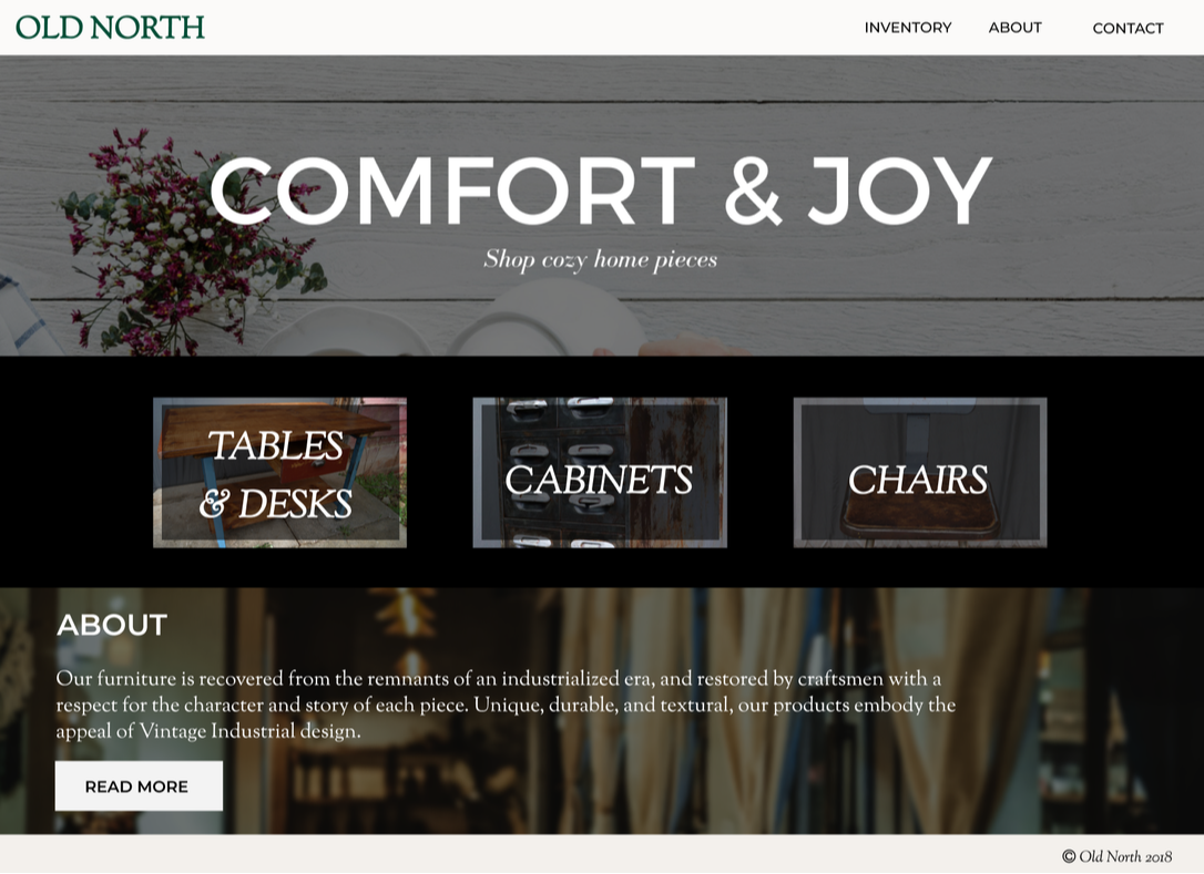
REFINEMENT & SUPPORT
|
After I presented my work so far and received feedback on my lo-fidelity prototypes, I reviewed what I had and decided what revisions should be made based on my classmates' critique. I then went to work on my next prototype.
|
HOMEPAGE -
|
|
|
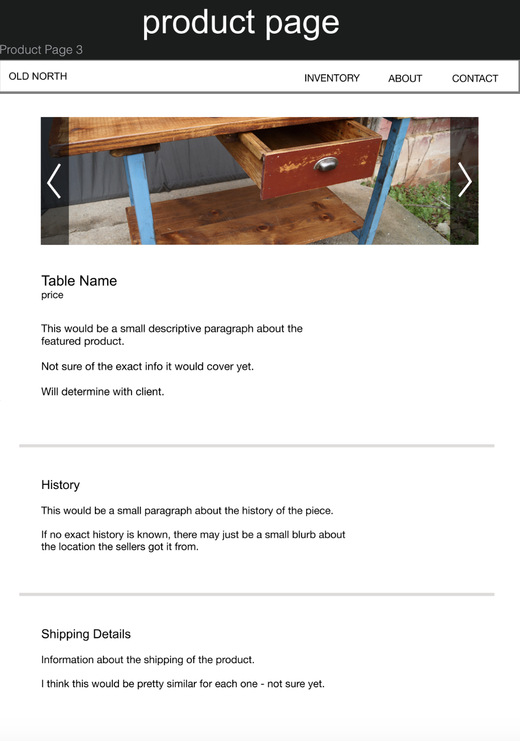
Since I didn't have all the written content yet, I used some filler text for my pages.
I presented my work at the end of Checkpoint #3, and got some more helpful feedback from my classmates. I always appreciate constructive criticism from others in my field, because there are always bound to be things I miss.
I presented my work at the end of Checkpoint #3, and got some more helpful feedback from my classmates. I always appreciate constructive criticism from others in my field, because there are always bound to be things I miss.
|
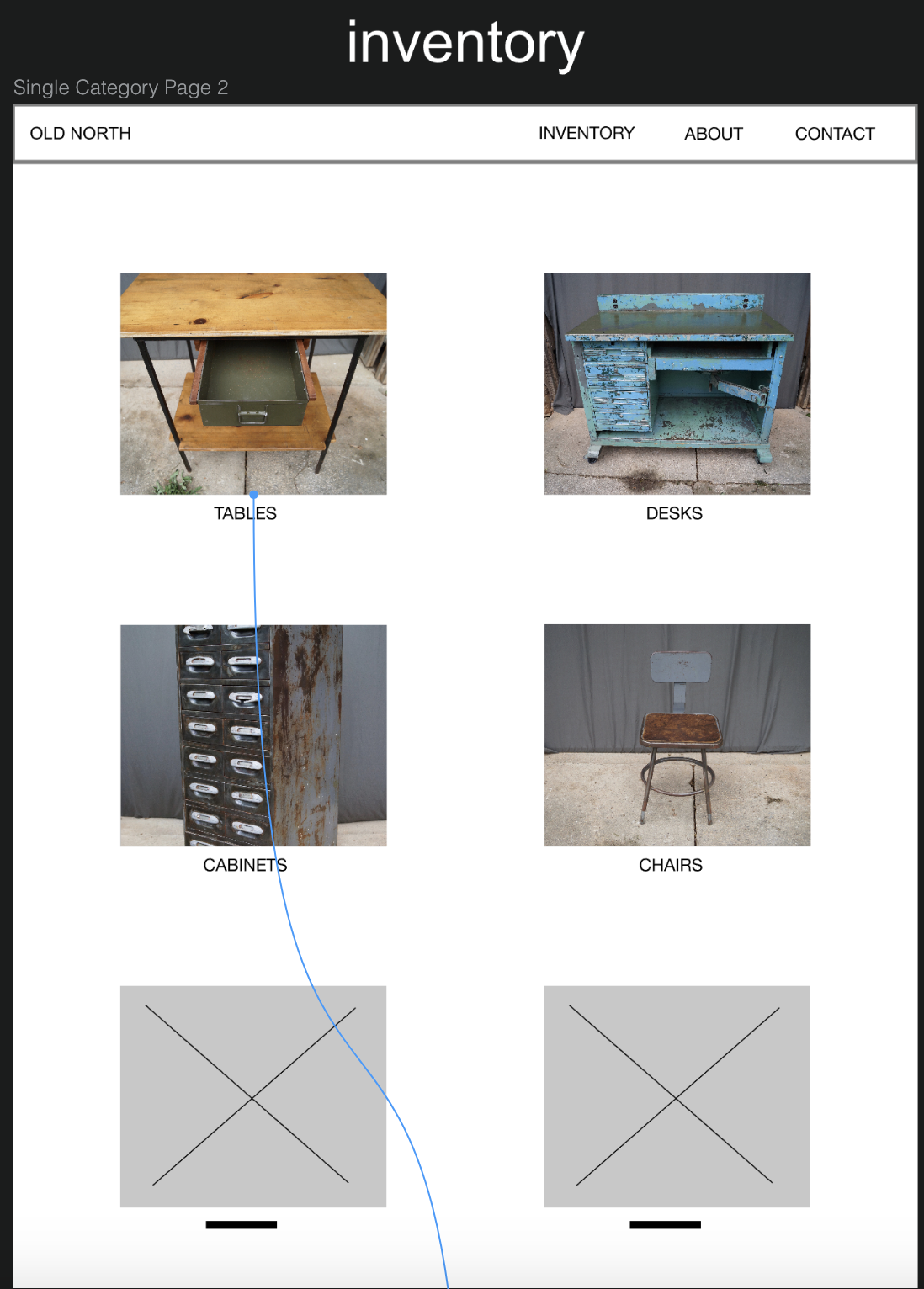
NAV BAR -
|
I was really struggling with the branding - I knew I needed a stronger visual identity but still wanted the site to remain simple. I asked my fellow classmates for some advice about how to create more of a brand identity, and they gave some helpful recommendations.
BRAND SUGGESTIONS
- use words like textural and industrial to inspire the brand
- match the look of the business
- look at sites of companies that sell similar products for fonts and color inspiration
- crate & barrel
- pottery barn
- williams-sonoma
- west elm
I went to work with those suggestions for revisions and moving forward.
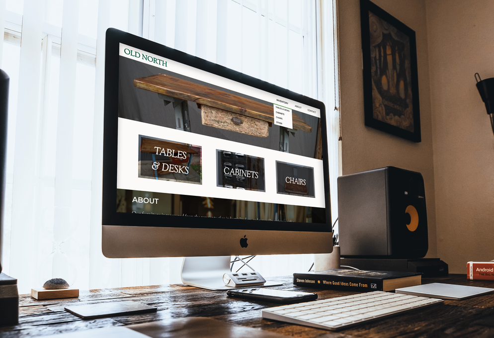
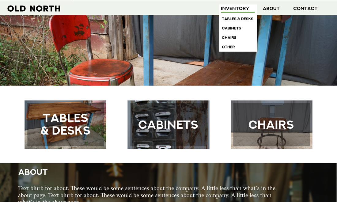
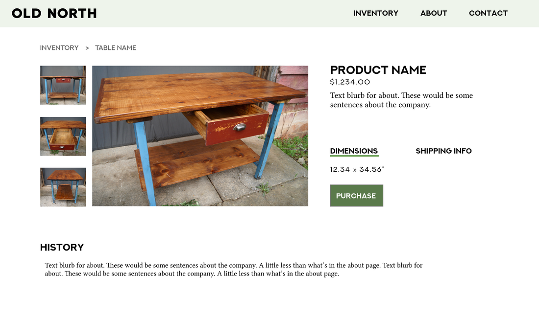
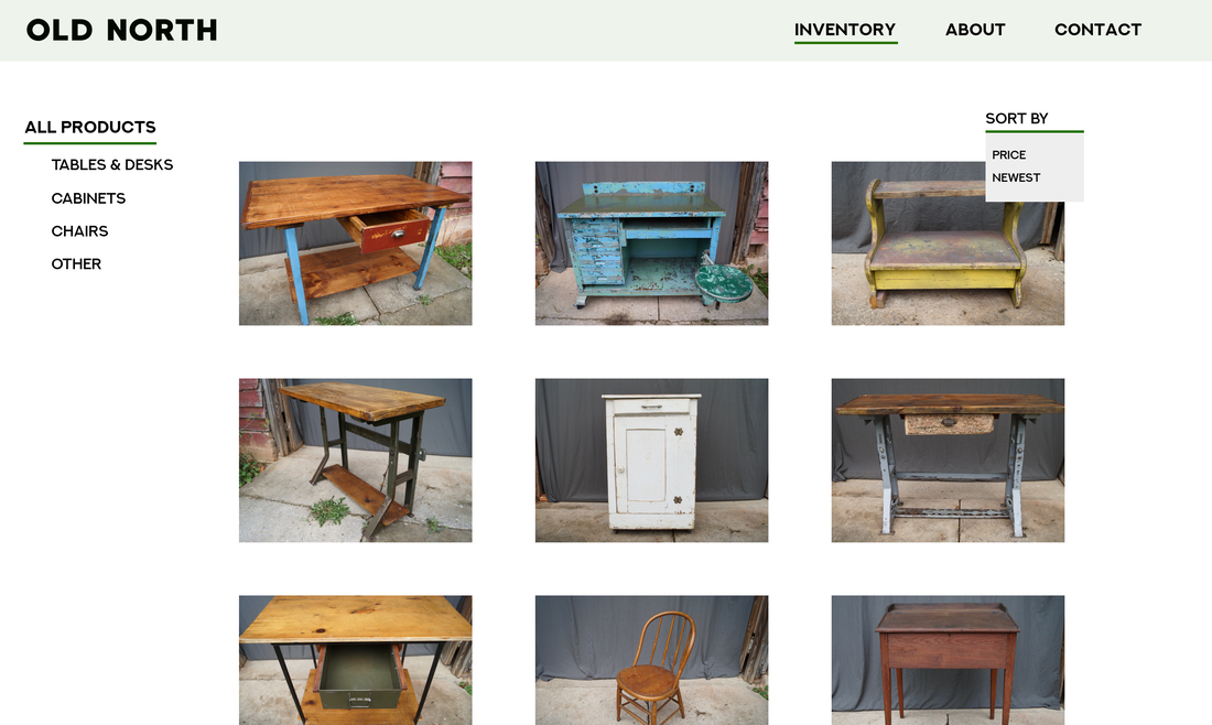
FINAL PRODUCT
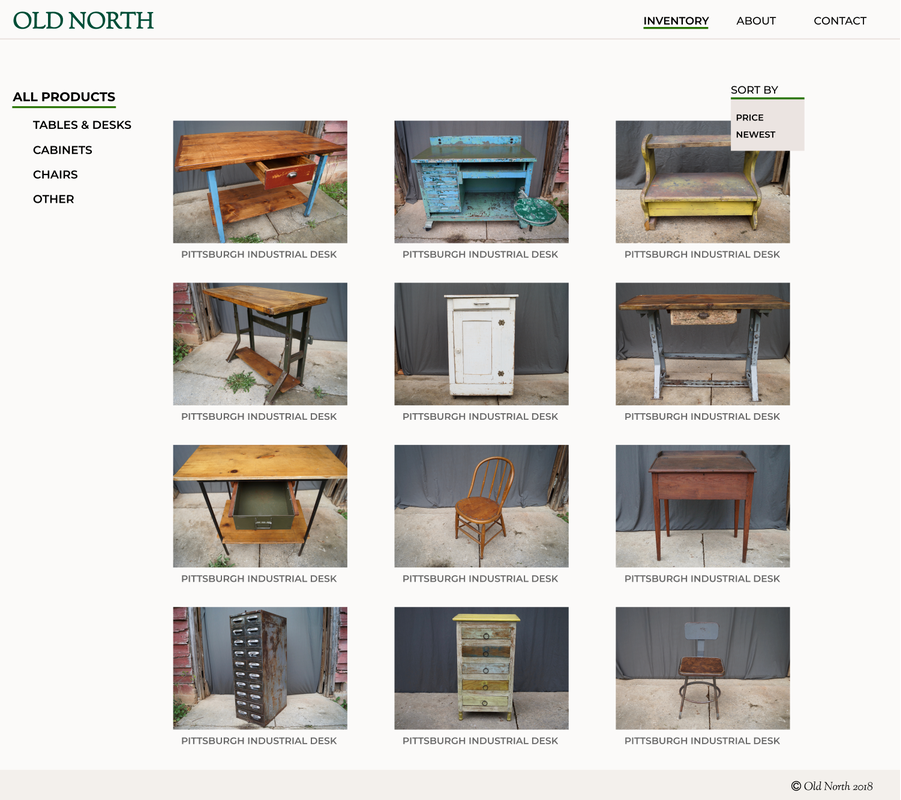
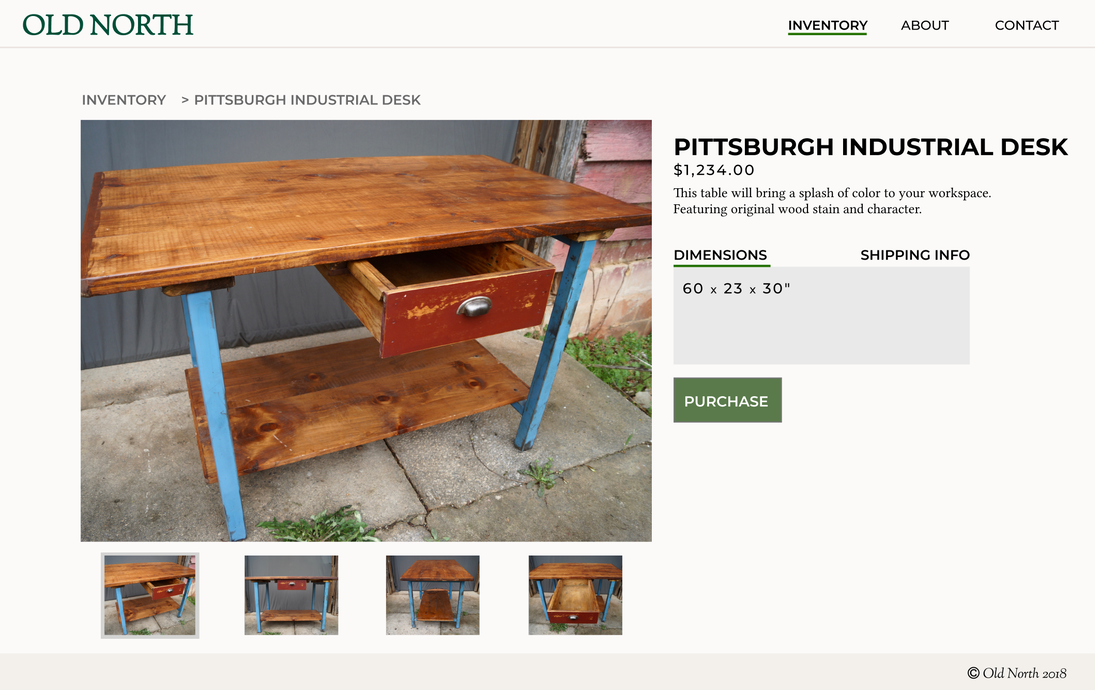
|
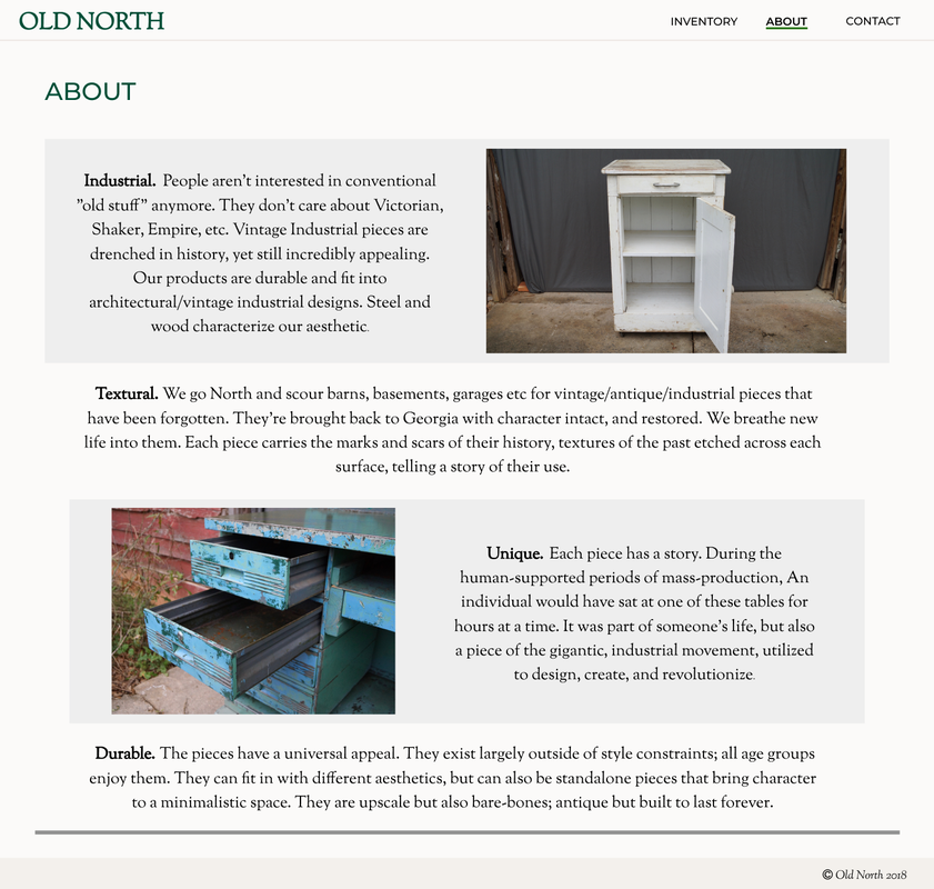
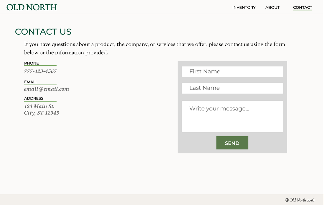
|
I'm happy with how this project turned out, and look forward to continuing work with my client to make this into an up-and-running online store.