PROJECT OVERVIEW
I conducted a Lean UX app design project leading a team of 4 in my Interaction Design II class. As the Scrum Master, I organized my team, ran voice conferences to keep up with what was happening on the project, oversaw prototyping and testing, and generally provided whatever my team needed. It was my job to ensure everyone was being heard and that effective collaborative design was occurring.
At the beginning of the semester, all of us in the class gave a pitch presentation on an idea for an app we had. Being in the process of planning for a trip I'm embarking on to England with my friend next year, I decided on pitching an app to make travel planning with friends simpler and more effective. I called my app Explore.
After the pitches, we all voted on whose projects we'd like to work on - 4 people would have their apps worked on and serve as Scrum Masters to their teams. I ended up having my app idea voted on by several others, and so was informed that I was to be Scrum Master and who my team members were.
THE TEAM
- Anne Morris (Scrum Master)
- Gabby Hunt
- Matt Penoyar
- Theo Davis
WHAT IS LEAN UX?
After teams had been assigned, we spent several weeks learning the concepts of Lean UX and how we would be applying them to our project.
Lean UX is a system of user experience design that is much more rapid, collaborative, and iterative than Goal-Directed Design. It's used when designers don't have as big of a budget or time frame as they might have when doing Goal-Directed Design. Instead of months of research and design, it works over a stretch of about 6 weeks to quickly get out an MVP (Minimum Viable Product) that can be given to users early on to learn what can be improved about the product. Instead of there being one main designer, this process runs many group brainstorming sessions to get many different perspectives and viewpoints. There is a heavy emphasis on prioritization and seeking to find out what the team has learned through the process. Throughout all of UX, the user is the main focus.
We learned the concepts below and utilized them in our project.
|
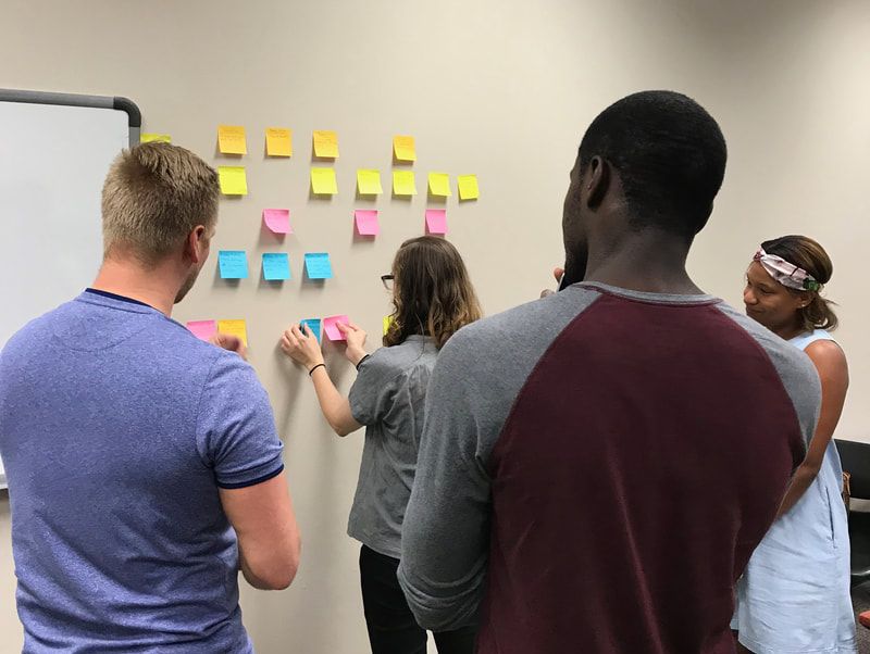
We had two Sprint Cycles scheduled in which to work. Sprint cycles allowed our team to be focusing on only a few things at a time while also knocking out a lot of work in 3-week periods. Before the cycles started, we did some simple affinity mapping to get our ideas about the app out early.
|
|
|
Affinity maps allow us to physically see our ideas for the app and decide what different concepts go together and what outliers might not need to be included.
This allowed us to see that we had several ideas in common about what the app would offer, like....
This allowed us to see that we had several ideas in common about what the app would offer, like....
- recommendations of places for the user to visit
- a way to see all their travel plans in one place
- deals and budget-saving info
- collaborative features to make planning with others easier
- sorting things they'd like to do on their trips into categories
SPRINT CYCLES
FIRST SPRINT
At the start of October, we began our first sprint cycle. This first cycle served to get us started on the project by getting our minds focused on our users, deciding features to work on based on user and business goals, and doing wireframing and lo-fidelity prototyping with which we conducted user tests. The feedback from our user tests then went into iteration work on the prototype; we revised based on what data we received and what we learned.
The sprint cycles run over 3 weeks: Design Zero (Week 1), Sprint #1 (Week 2), Sprint #2 (Week 3). Each sprint cycle ends with a review presentation to update stakeholders on what has been happening with the project.
|
ASSUMPTIONS AND HYPOTHESIS STATEMENTS
For Design Zero, We began by writing out assumptions about what we thought about our product, our potential users, and the business market. The purpose of doing this was to make sure we got our own ideas on the table right off the bat, so we would be aware of what were our opinions and what was based on outcomes for users. The point of our overall design process was to focus on users' desired outcomes, and assumption writing helped us to start that train of thinking.
Our next step was creating hypothesis statements.
To do this, we made a list of business outcomes, proto-personas, user outcomes, and features. These would fit together in a template that created a testable hypothesis statement. These statements would allow us to decide features we wanted to focus on implementing and help us prioritize them in order of importance.
We believe that we will achieve [business outcome] if [proto-persona] can achieve [user outcome] using [feature].
- Business outcomes are things we would like to achieve in our company.
- Proto-personas are similar to Goal-Directed Design's personas; they are essentially representations of real users, so that we're not just designing for statistics and people in general. Proto-personas are different in Lean UX because they're quickly arranged instead of informing them with long periods of user research and interviews. They are free to be revised as needed as the process continues.
- User outcomes come from our proto-personas. They are the desires, goals, and outcomes of our personas/users; they are not simply tasks the user needs to achieve, but deep dreams the user has overall. Sometimes these outcomes can be vague and/or subconscious. They are based on feeling.
- Features are what we plan to implement in the app that work with both the business and user outcomes.
|
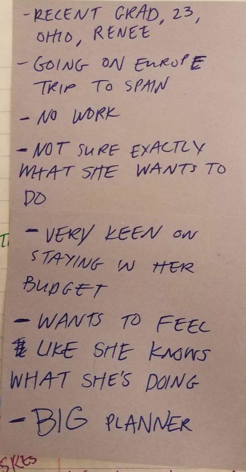
Proto-Persona Renee
|
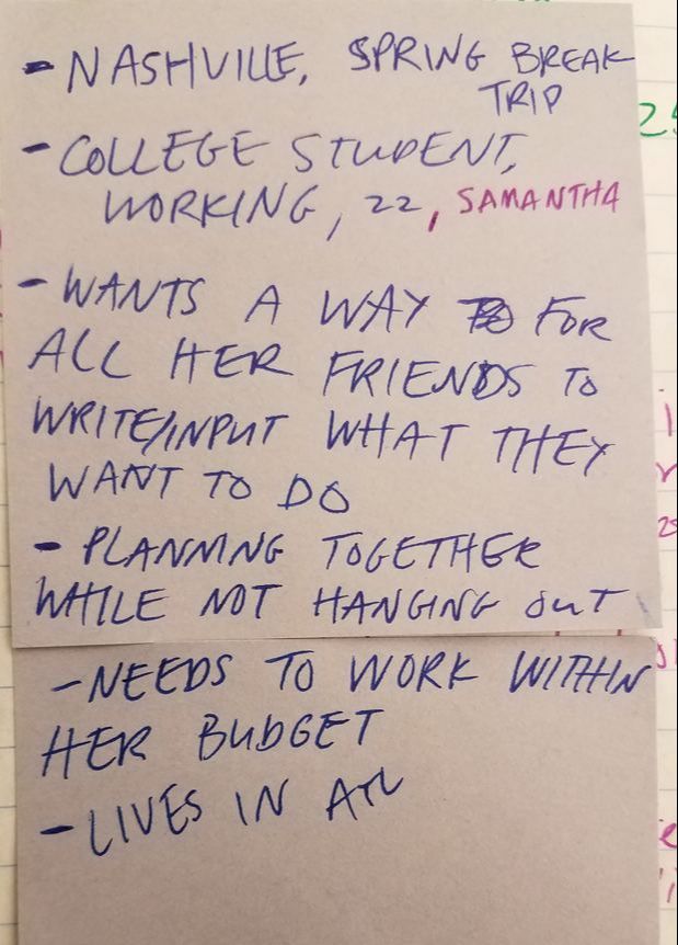
Proto-Persona Samantha
|
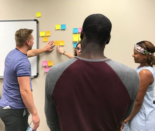
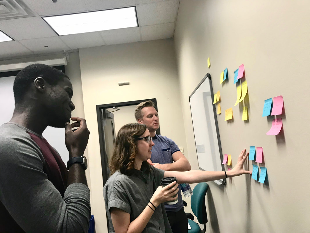
With those brainstormed, we took them to the whiteboard to start arranging them around the template.
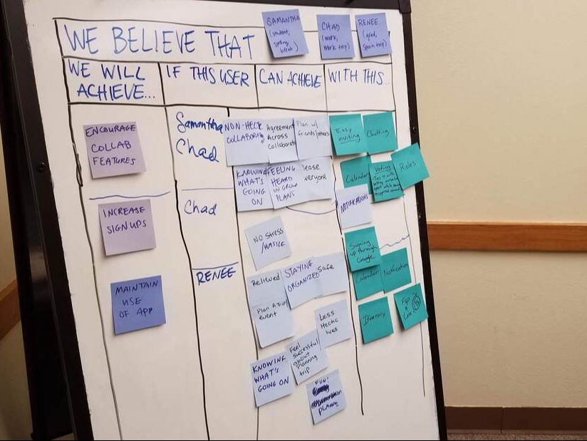
|
|
After moving our post-it notes with our ideas around for a while, we came up with a list of hypothesis statements to test, providing us with features to start designing. Here is an example:
We believe that we will achieve maintained use of the app if Renee can stay feeling organized using the itinerary feature.
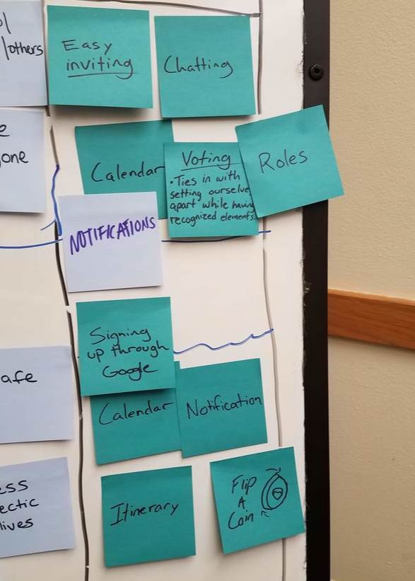
Based on our hypothesis statements, we created a product backlog: a document containing all of the statements we created and by extension all the features we wanted to implement in our product. The backlog serves as a plan for what to work on over the sprint cycles. Then we used the product backlog to create our first sprint backlog: a plan for the rest of this sprint cycle. We decided we wanted to focus on 3 features for this cycle:
WIREFRAMING & PROTOTYPING
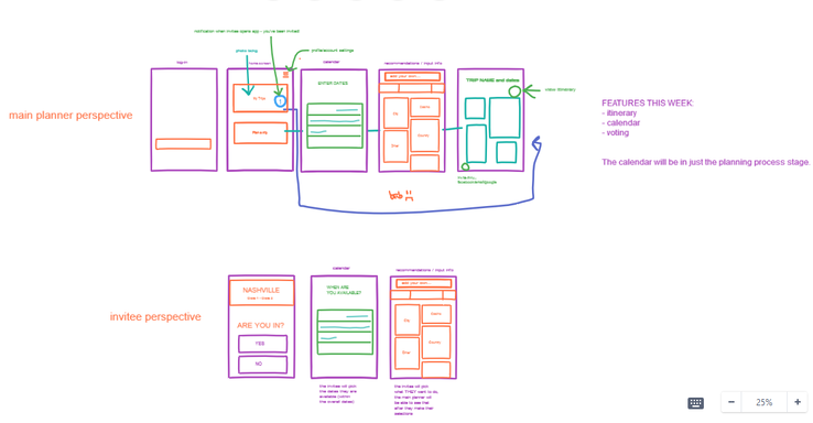
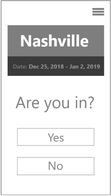
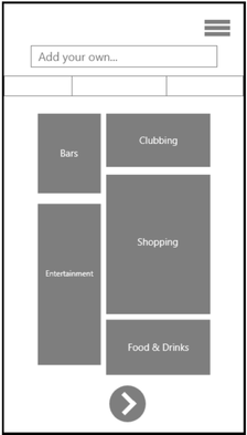
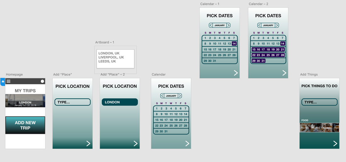
After our focus features were decided on, we began wireframing as a group to figure out how the interactions inside the app would work.
We wanted to keep the interactions relatively simple for the user, following a basic procedure of having them choose a destination, then trip dates, then add places they'd like to go. Finally, they'd see the places they chose on an itinerary screen. We decided to get these core interactions designed before focusing on collaborative features like voting.
We also considered having different screens for users invited to a trip on the app by their friends.
We believe that we will achieve maintained use of the app if Renee can stay feeling organized using the itinerary feature.
Based on our hypothesis statements, we created a product backlog: a document containing all of the statements we created and by extension all the features we wanted to implement in our product. The backlog serves as a plan for what to work on over the sprint cycles. Then we used the product backlog to create our first sprint backlog: a plan for the rest of this sprint cycle. We decided we wanted to focus on 3 features for this cycle:
- voting
- calendar
- itinerary
WIREFRAMING & PROTOTYPING
After our focus features were decided on, we began wireframing as a group to figure out how the interactions inside the app would work.
We wanted to keep the interactions relatively simple for the user, following a basic procedure of having them choose a destination, then trip dates, then add places they'd like to go. Finally, they'd see the places they chose on an itinerary screen. We decided to get these core interactions designed before focusing on collaborative features like voting.
We also considered having different screens for users invited to a trip on the app by their friends.
After we designed the basic interaction framework, we were able to move onto lo-fidelity prototyping. We would use this prototype in our first round of user testing.
|
|
USER TESTING
We conducted our user tests on campus in the Computer Science & Engineering Lab. Matt and Gabby went throughout the building and recruited students who weren't busy. We had two participants partake in user testing for our first sprint.
We conducted our user tests on campus in the Computer Science & Engineering Lab. Matt and Gabby went throughout the building and recruited students who weren't busy. We had two participants partake in user testing for our first sprint.
|
|
|
FEEDBACK
|
Overall, our prototype was liked overall by our participants, but there were some definite stumbling points when going through the app.
REVISIONS
Using the feedback from our user test, we decided to create a new prototype that might be a smoother process for usability testing.
Using the feedback from our user test, we decided to create a new prototype that might be a smoother process for usability testing.
Changes we made:
PRESENTATION
At the end of this sprint, Matt gave a presentation to update the class on what our team had been doing.
- Users were getting stumped when adding a location to visit with our previous prototype, so we made that step easier in this iteration.
- To make better use of our space and not overwhelm the user with so much on the recommendations screen, we inserted a slider that would contain different places. We had only one slider for this prototype to test if our idea worked.
- We also wanted to add in more practical recommendations later on, as this was something users had expressed wanting.
PRESENTATION
At the end of this sprint, Matt gave a presentation to update the class on what our team had been doing.
SECOND SPRINT
After this review presentation, we began our second sprint cycle. Our second sprint served to figure out what we learned from our first sprint and to re-prioritize ourselves. After examining our product backlog, we decided what had been successful and what hadn't, then used that knowledge to create our 2nd sprint backlog. We divided the work into individual tasks this cycle to make the most of our time. Moving onto a hi-fidelity prototype, we did more user testing and revisions.
This sprint cycle ran over 3 weeks as well: Design Zero, Sprint #1, and Sprint #2.
|
EXPERIMENT STORIES
Experiment stories are a way to see what the team has learned, and helps the team re-organize the focus of the project so they're not trying to do too much at once. We took our earlier hypothesis statements and reworked them to make them more specific, and only focused on the ones whose features had been successful from our research thus far. Along with the recreated hypothesis, experiment stories include tactic(s) to learn if the hypothesis works and a team member that the tactic is assigned to.
Here is an example of one we created:
We believe that giving users the voting option in the planning will draw more users to the collaborative features in the app.
Tactics: Voting screen user test, prototyping
Assigned to: Theo
After creating our experiment stories, our prioritization led us to focus on a few features and design details.
|
- Users were liking the idea of voting features and we wanted to work on implementing these in a more detailed way.
- We still wanted to test if the admin roles idea would work out. Users had expressed interest in having different roles for friends on a trip, but we hadn't tried inserting this in our prototype yet.
- Some button text was confusing to users and could be simplified.
- We wanted to begin fleshing out the visual brand identity.
INDIVIDUAL TASKS
Gabby and Theo went to work sketching for the prototype features, Matt started simplifying the protoype's content, and I began pulling together a brand identity.
Gabby and Theo went to work sketching for the prototype features, Matt started simplifying the protoype's content, and I began pulling together a brand identity.
SKETCHING
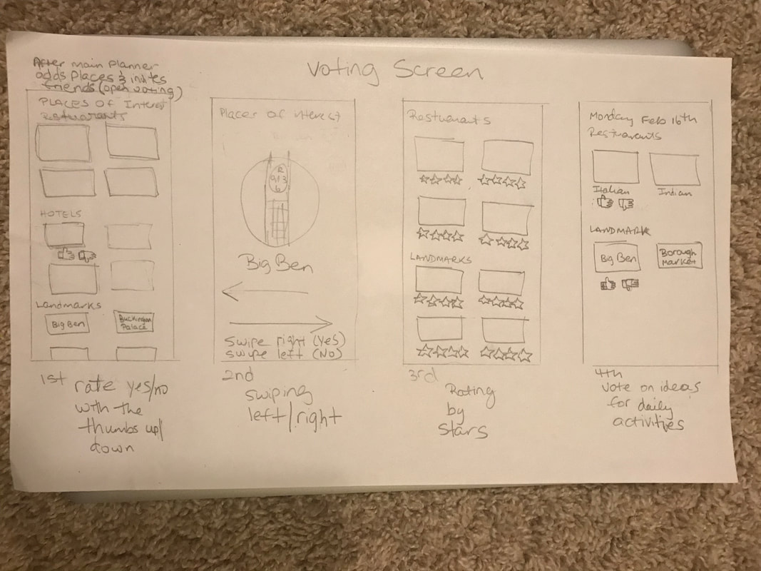
Voting Screen
|
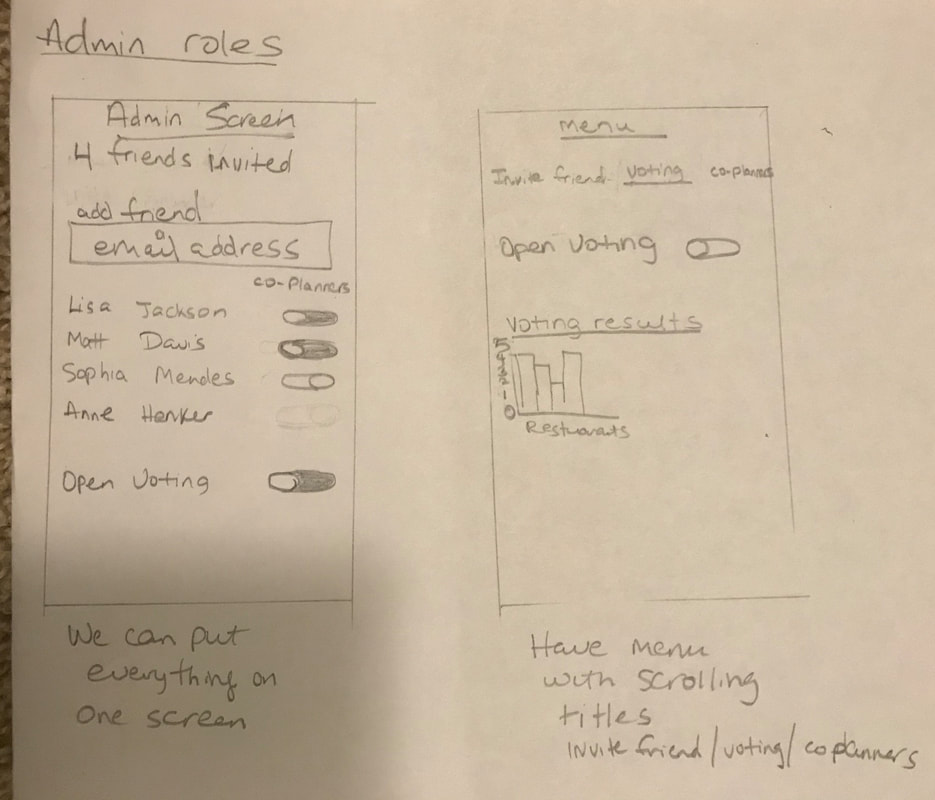
Admin Roles
|
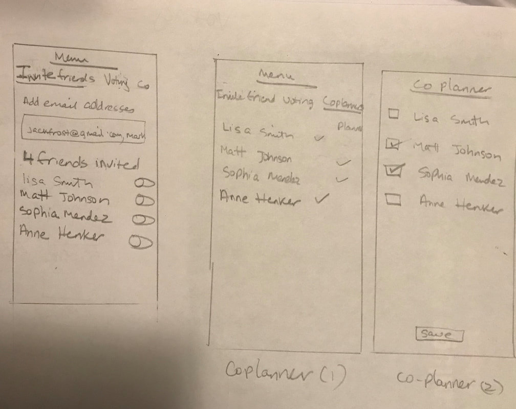
Admin Roles
|
BRAND IDENTITY

|
|
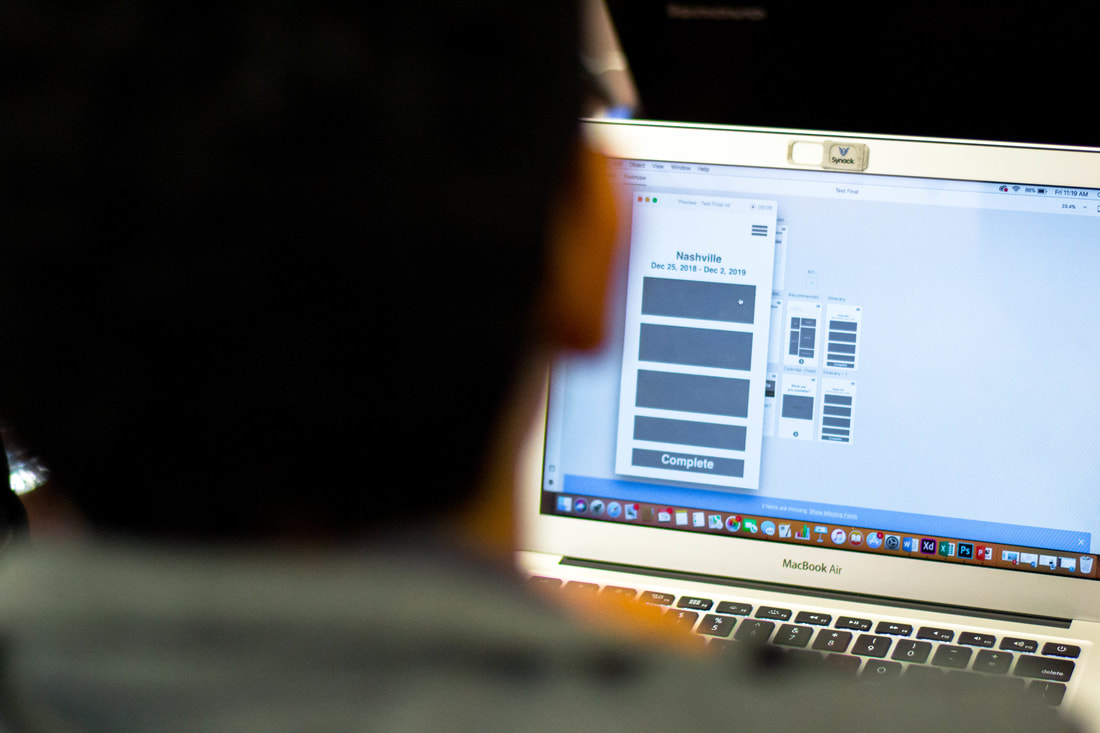
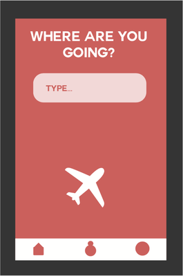
HI-FIDELITY PROTOTYPING
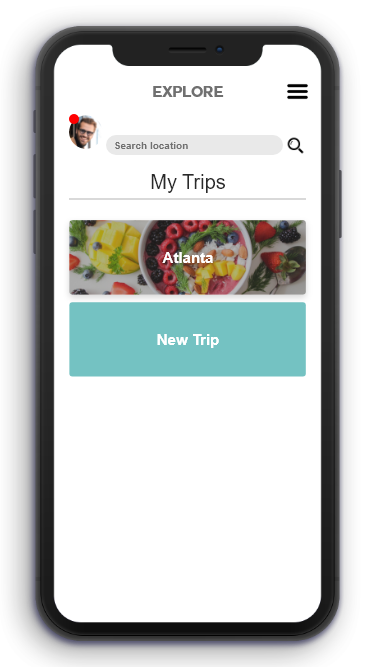
Homepage
|
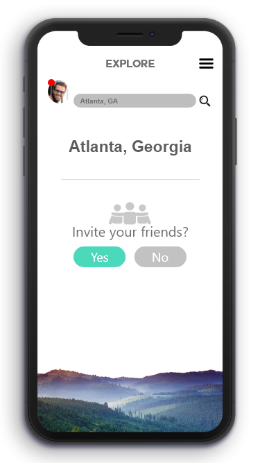
New Trip
|
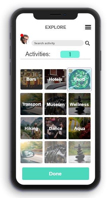
Activities / Recommendations
|
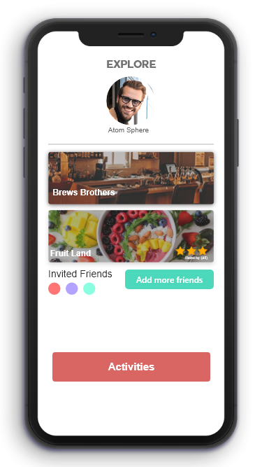
Itinerary
|
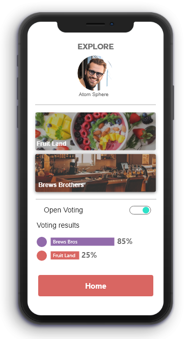
Voting
|
USER TESTING & ITERATION
We did some more quick user testing to see how our hi-fidelity prototype would do with real people, and worked the feedback into revisions.
FEEDBACK / REVISIONS
Being that we were at the end of our cycle, we worked in the user testing feedback pretty rapidly.
We did some more quick user testing to see how our hi-fidelity prototype would do with real people, and worked the feedback into revisions.
FEEDBACK / REVISIONS
Being that we were at the end of our cycle, we worked in the user testing feedback pretty rapidly.
|
2ND REVIEW PRESENTATION
Theo gave the review presentation at the end of this sprint to further update the class on our progress.
Theo gave the review presentation at the end of this sprint to further update the class on our progress.
FINAL PRESENTATION
At the end of the semester, I gave an overview of our process work to the class to show that we had been productive with our time together.
I had a great team for this project, who gave 100% effort, and I'm glad to have worked with them. I think we created a great app design and hope it will go places in the future.
I had a great team for this project, who gave 100% effort, and I'm glad to have worked with them. I think we created a great app design and hope it will go places in the future.
| final_presentation_-_explore.pdf |